Graffiti can be defined as a form of nonverbal communication that conveys messages through images and writing. Graffiti has evolved into a public medium of expression and a form of art and digital design. One of its developments is evident in the use of graffiti fonts in visual design. Through a graffiti font style combination, one design can present a strong visual character while leaving a deep impression.
Among various combinations out there, there are three most popular styles that stand out: Wildstyle, Throw-Up, and Tag. Wildstyle has quite intricate detail, with connected lines and decorative elements that require a high level of skill. Throw-Up features letters in a bold and striking bubble form. Meanwhile, Tag or Tagging usually serves as the artist’s signature, with a spontaneous and easily recognizable form.
In the real world, Wildstyle and Throw-Up rarely stand alone. Artists usually add Tag to create a cohesive visual impression through a balanced combination. While the main style showcases aesthetic strength, Tag serves as a personal marker, reinforcing the artist’s identity in the already created work.
Using a graffiti font style combination will strengthen the look of your design and reflect a movement that is commonly found in the street walls or open spaces. Hence, this article will explain more about the graffiti font style combinations that offer a distinctive dynamic.
Table of Contents
10 Ultimate Collection of Graffiti Font Style Combinations
Discover 10 stunning graffiti font style combinations, blending two main styles into a single captivating artwork. Every combination presents a unique feature that defines each style while also establishing a harmonious balance between the visual appeal and the essence of street-art dynamics.
Grafstroke x Sprayflow
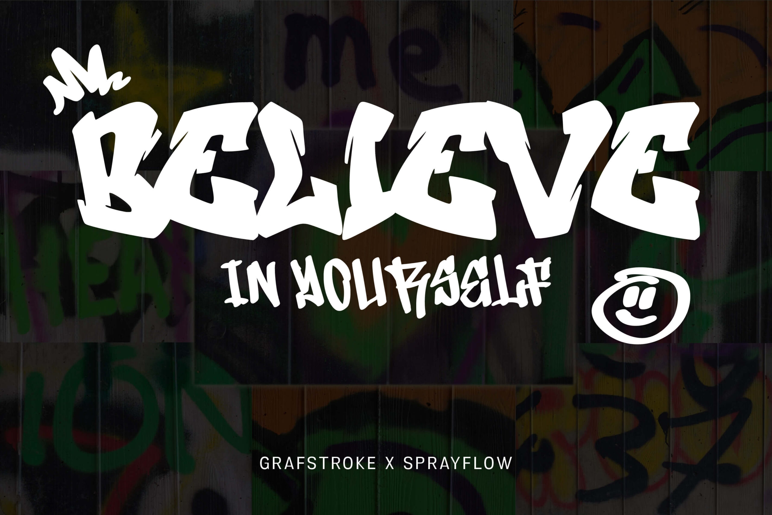
The first graffiti font style combination is Grafstroke and Sprayflow. This combination creates bold strokes with solid letterforms. Grafstroke highlights the bold lines, sharp edges, and solid structure of the fonts, reflecting the power of visual control. Meanwhile, SprayFlow shows daring curves, spray effects, and dynamic flow that perfectly represent the street art style. This graffiti font style combination presents a harmony between the firmness of form and the fluidity of movement, thus giving an impression that is both energetic and free. This combination can be applied to hip-hop music posters, urban-themed murals, or branding that emphasizes freedom of expression.
Skate Rush x Bambits
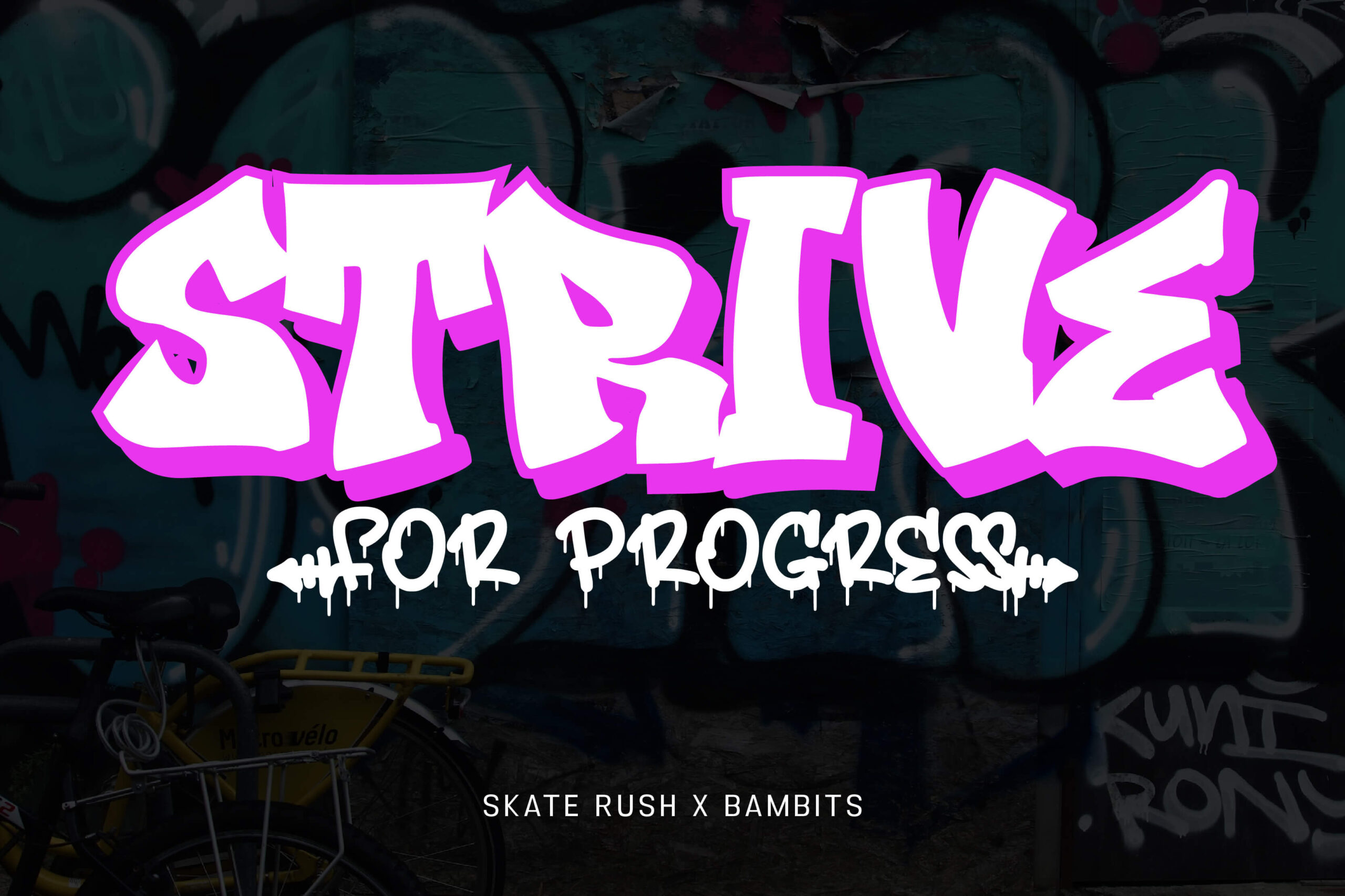
An energetic and spirited graffiti font style combination is born through Skate Rush and Bambits. Skate Rush features bold and dynamic uppercase letters that reflect the free-spirited essence of street culture, especially in the world of skateboarding. On the other hand, Bambits presents letters that are more fluid, light, and playful, complemented by paint drip accents that enhance the artistic impression. Skate Rush provides a solid look, while Bambits adds a relaxed and artistic touch. This combination is suitable for urban-themed visual works, streetwear designs, or event posters that want to emphasize a progressive spirit.
Bosskids x Bomberboy
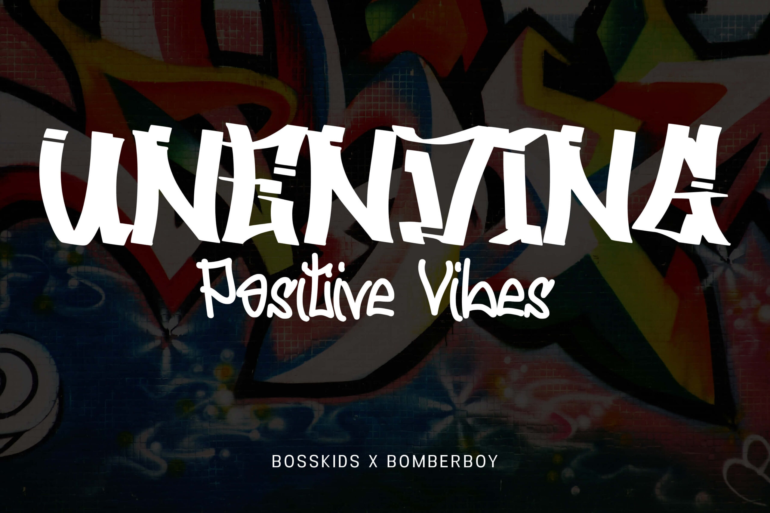
Having entirely different characters, Bosskids and Bomberboy form a graffiti font style combination that unites a bold character with relaxed and humanistic writing. Bosskids features bold letter characters, sturdy proportions, and long brush strokes like calligraphy brushes and has broken line access, giving a strong streetlife impression. On the other hand, Bomberboy highlights its character through curves that are not entirely smooth, with arcs that slightly leave sharp angles. Both present typography that is strong yet friendly, as they combine the strength of street character with fluidity. This font combination is suitable for community murals, positive-themed posters, or apparel designs that want to convey an optimistic and energetic spirit.
Graftink x Streetlife
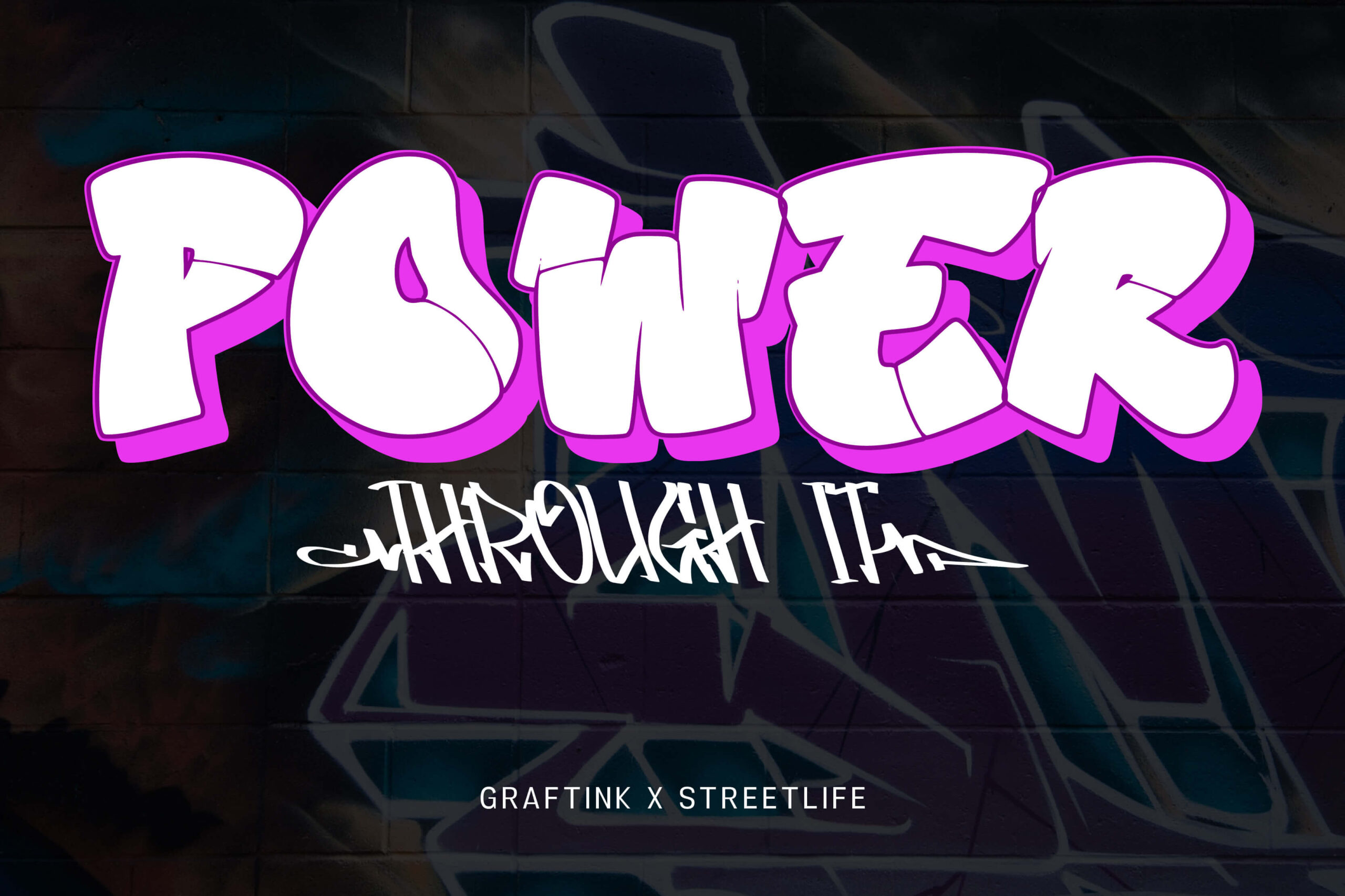
The combination of the Graftink and Streetlife fonts showcases a graffiti style that blends visual strength with free expression. The Graftink font on the word “POWER” has a thick and rounded bubble font character, is filled with smooth curves, and combines wildstyle and throw-up styles. On the other hand, the Streetlife font on the words “THROUGH IT” features letterforms resembling quick, dynamic, and fluid handwriting, reflecting the typical graffiti tag style. With its strong, bold, and expressive characters, it forms a captivating graffiti font style combination. This combo is perfect for streetwear-themed designs, hip-hop music, urban events, or digital murals.
Bomber Rockstar x Skater Squad
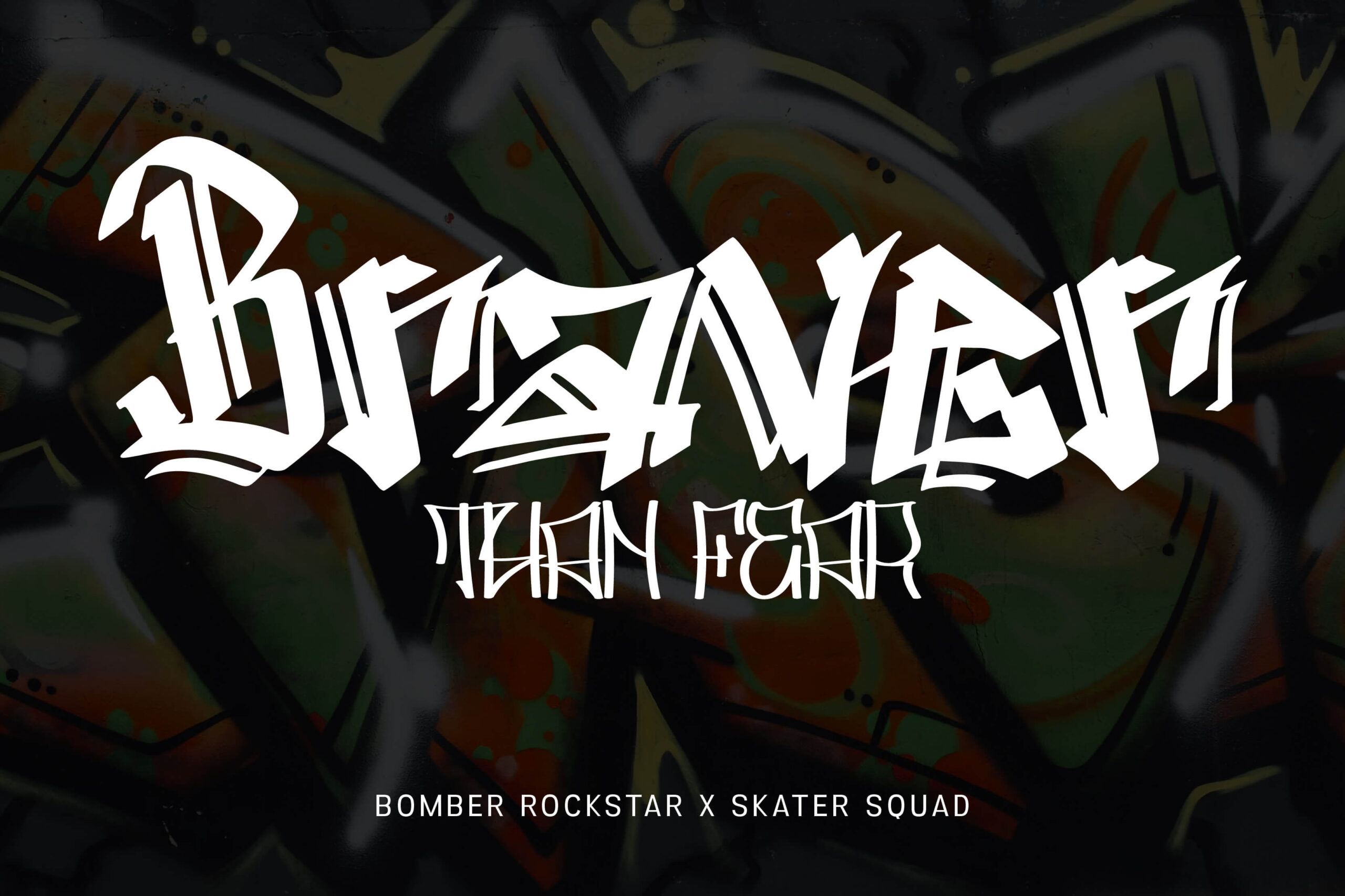
The bold yet expressive graffiti style is born of the combination of the Bomber Rockstar and Skater Squad fonts. Bomber Rockstar has a shape resembling blackletter but is packaged in a decorative wildstyle with curves and sharp cuts. On the other hand, Skater Squad presents a thin and elongated form with a long vertical structure, resembling graffiti on a wall. Its thin lines provide contrast when paired with bold fonts like Bomber Rockstar, creating visual balance. The asymmetrical curves give a wild feel, as if the letters are in motion.
Urban Blocker x Streetfire
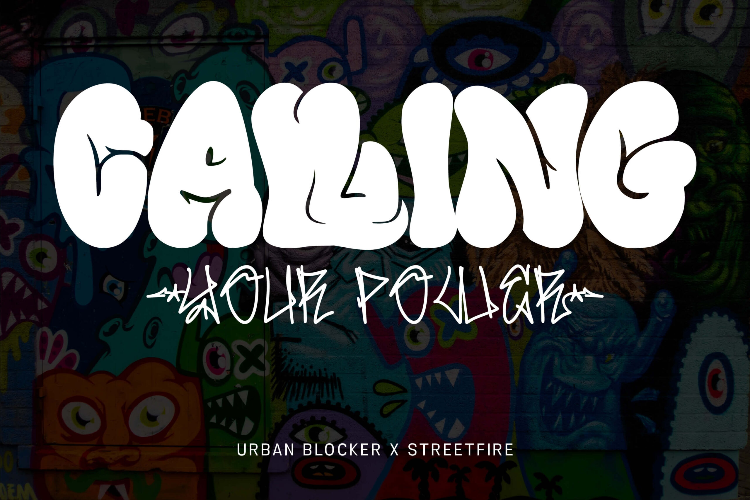
This time, there is a combination that unites to form graffiti typography that is friendly, energetic, and expressive. Urban Blocker features filled, bold, and rounded letters with a large volume, creating a playful yet loud impression, instantly grabbing attention. Streetfire, showcasing typical tagging strokes and featuring repeated line pulls in several parts, is combined with Urban Blocker to create a dynamic graffiti typography that is friendly, energetic, and expressive. Its uniqueness lies in its informal, somewhat “random,” yet artistic form, giving a wild and free impression. This graffiti font style combination blends the playful and eye-catching aspects of bubble style with the raw and rebellious elements of handstyle.
Bostero x Streetbomber
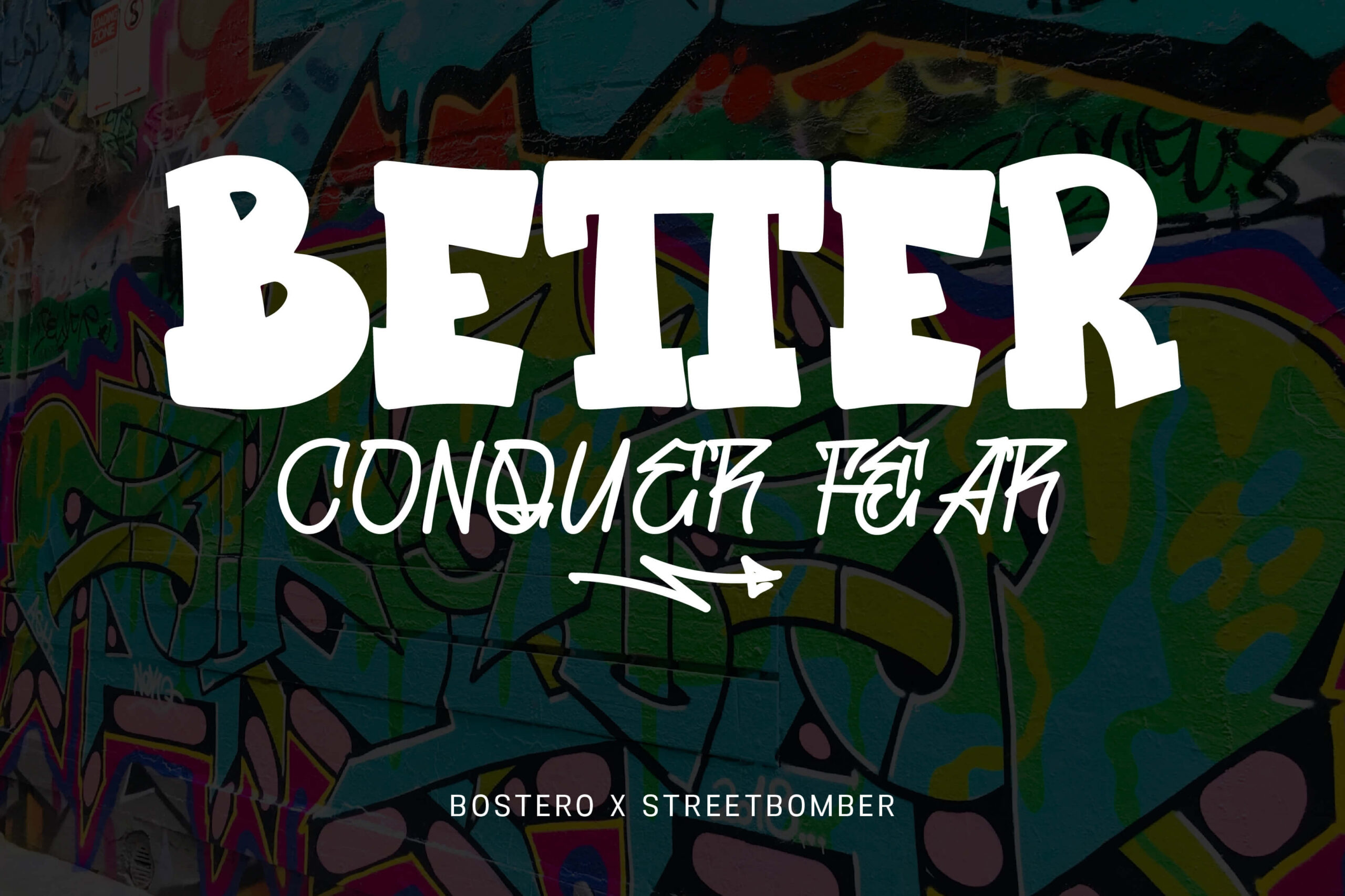
Bostero and Streetbomber are not just typography but also visual mediums that reflect freedom and joy in creation. The main text of the word “BETTER” uses the Bostero font, with thick, rigid, and symmetrical character construction. Each letter appears rigid, resembling blocks with rounded corners, yet still conveys an urban street art vibe. The tagline “CONQUER FEAR” in Streetbomber font presents a graffiti handstyle resembling a spontaneous scribble with a marker or spray paint. With the unique arrow accent that can be placed below the text, it adds the distinctive character of street art graffiti. This graffiti font style creates an authentic, bold, and energetic impression, suitable for streetwear themes, music posters, and urban murals.
Bounce Drip x Diphole
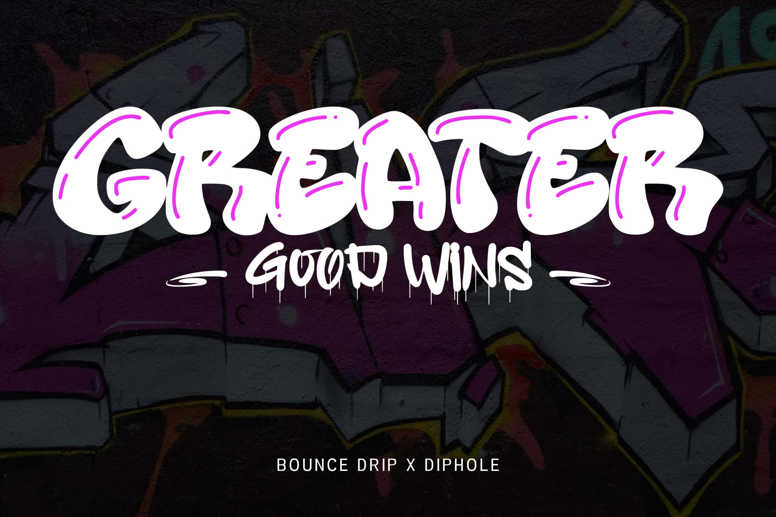
Bounce Drip dan Diphole merupakan kombinasi gaya font graffiti yang penuh energi, ekspresif, dan sangat lekat dengan nuansa street art. Bounce Drip menampilkan bentuk huruf besar, gemuk, dan berisi seperti balon atau gelembung. Beberapa bagian huruf memiliki lapisan tambahan yang berfungsi memberikan kesan highlight secara instan dan mudah, sekaligus memperkuat kesan otentik bahwa tulisan ini dibuat secara manual. Dengan lapisan tambahan, ditunjukan untuk mempermudah pemberian efek dimensi atau memberikan highlight. Sementara itu, dipadukan dengan visual yang menguatkan citra street culture yang autentik dan rebellious. Diphole dengan karakter huruf lebih ramping dengan efek tetesan cat yang dinamis, memberikan nuansa raw dan liar. Bounce Drip dan DipholeCocok untuk tema streetwear, album musik hip-hop, poster acara urban, atau desain mural.
Inkfury x Vollome
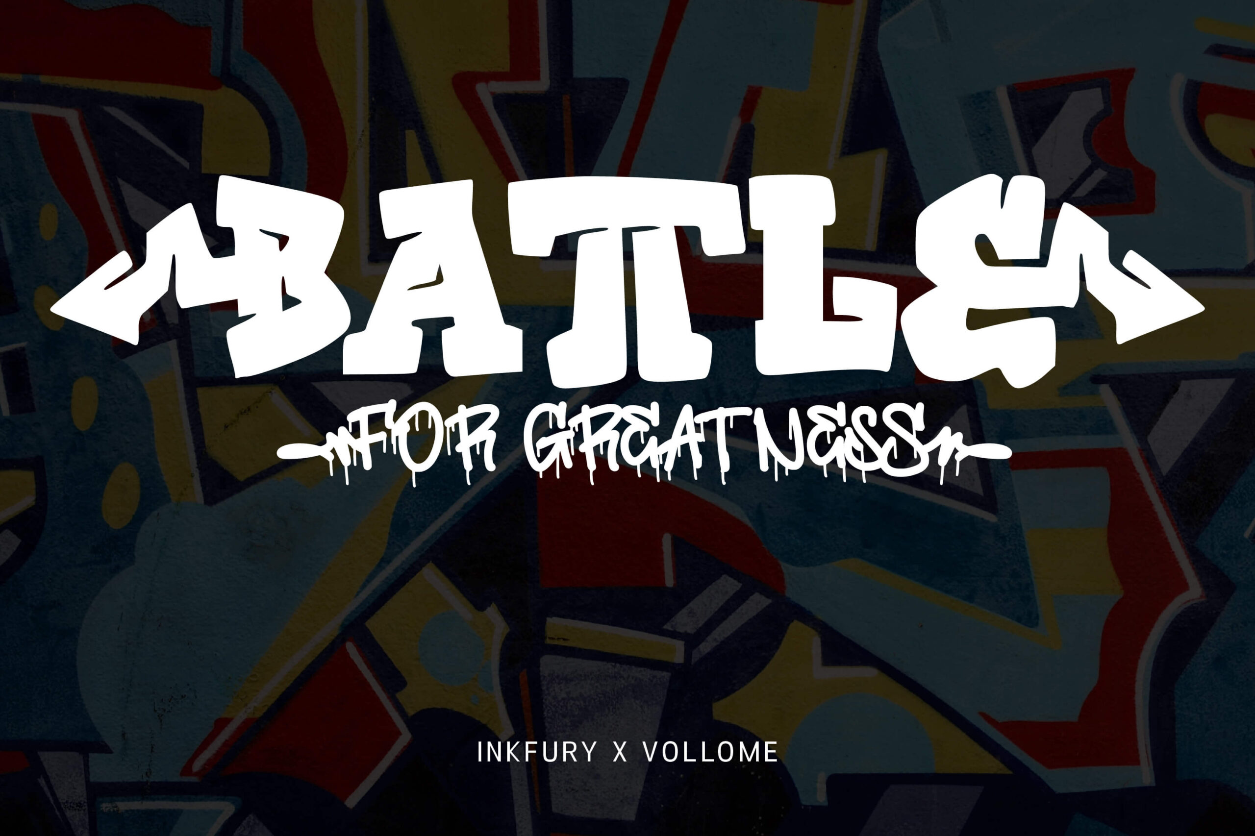
The next graffiti font style combination is Inkfury and Vollome, which form a typography style that merges block letters with an additional tagging style. Inkfury features large, bold letters with a sturdy structure resembling classic graffiti. The arrow-shaped stylistic set adds a unique touch, emphasizing a bold and dominant impression. Meanwhile, Vollome features thin, expressive, and wild dripping accents, with a more free-flowing form that resembles the result of spray paint writing. Inkfury and Vollome are unique because they successfully combine solid graffiti blocks with dripping handstyle, resulting in typography full of contrast, energy, and a close connection to street culture. This combo is ideal for street battle posters, hip-hop events, streetwear branding, and murals.
Bomber Dreams x Maybach
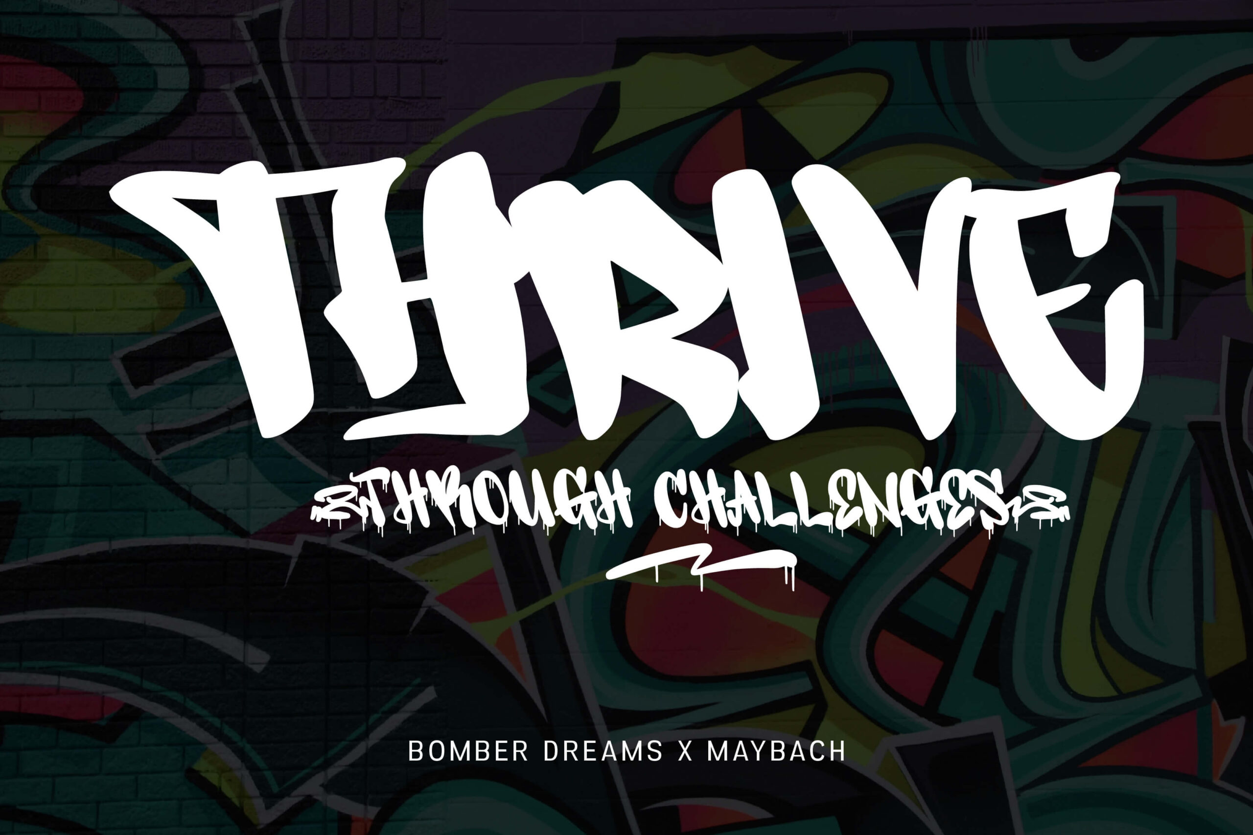
Last but not least, the combination of Bomber Dreams and Maybach features graffiti typography that blends the distinctive energy of bombing or tagging with a bold style. Bomber Dreams features bold, full uppercase letters with dynamic stroke lines, creating a striking impression in public spaces. Meanwhile, Maybach provides expressive details through paint drip effects and varied lines, capable of presenting a wild yet aesthetic atmosphere. Quick expression, rhythm of strokes, and visual signatures become the identity that connects this style with tagging. This graffiti font style combination is well-suited for use in hip-hop event posters, mural designs, and streetwear branding, as it effectively conveys a strong urban identity.
Try these fonts and find your best combo!
These 10 combinations emphasize that typography not only serves as a medium of communication but also as a means of expression, freedom, and creativity. Each graffiti font style combination demonstrates how wildstyle, throw-up, and tagging styles can blend to form unique typography that is also in harmony with contemporary visual culture. You can make the combination of graffiti font styles a source of creative energy to produce bold, authentic, and meaningful visual works. Use this freedom of expression to assert your message and strengthen your brand’s visual identity. Don’t be afraid to start experimenting now, and let your design speak volumes!