In today’s world, where everything is visual, we are bombarded with hundreds of graphic forms every day, but then, only a few of them remain memorable. What makes a simple shape able to communicate a company’s values and image? That is the power of the strongest visual symbol, a logo.
A logo is a visual form that represents the identity of a brand, business, organization, or person. It can take the shape of words, images, symbols, or a combination of these elements to produce a visual. A logo’s purpose is to separate a brand from its competitors while also strengthening the brand’s image. Additionally, a logo can leave an immediate impact, convey a message, and is frequently the first piece that the audience sees before learning more about the product or services you offer.

Logos have undergone a long evolution, from symbols filled with artistic details to now becoming more concise and efficient visual symbols. This change is not just a matter of style but also a reflection of how design adapts to the behaviors and needs of the era, which then will create a new concept of a modern logo.
Table of Contents
Modern logos are a type of logo designed with a contemporary visual approach that emphasizes simplicity, clarity of form, and flexibility of use. Modern logos will evolve in response to the fast-paced digital era, where visuals must be easily recognizable across various sizes and media. The main focus of a modern logo is not only on its attractive appearance but also on its function and ability to strongly represent the brand identity. There are a wide range of types of logos based on your characteristics and goals.
Aside from looking updated, the modern logo is also about the clarity of visual message, the efficiency of shape, and sustainability. This type of logo integrates technology and design into a cohesive element that enhances high-quality visual communication in the digital era. Listed below are the characteristics of a modern logo that maintain its relevance and effectiveness:
The modern logo emphasizes simplicity in design, ensuring it stays memorable and easily recognizable. The design strikes a perfect balance, ensuring that the audience can effortlessly grasp the brand identity while maintaining clarity and meaning.
A modern logo must be usable in various formats, both digital and print. This means its design must remain strong whether displayed in large or small versions and in color or grayscale.
The logo design must align with the brand identity and its target audience. Modern logos tend to use colors, shapes, and typography that match the brand image while still adhering to contemporary visual styles.
Despite its contemporary appearance, modern logo style does not adhere to fleeting trends. The best modern logos are created with a long-term vision in mind, ensuring that they will remain relevant for years to come without the need for design changes.
A modern-style logo is not only beautiful but also capable of creating a lasting impression and identity for its brand. Whether in the form of a symbol, text, or a combination, a logo should immediately convey who the brand is and what values it represents.
Modern logos from famous brands are not easily outdated, not because they always follow the latest trends. Rather, they adhere to solid and timeless design principles. In reality, because they do not follow the ongoing trends, their logos become iconic for future generations. In the world of branding, logos do not have to continuously change for the sake of the trend. In fact, most memorable logos are those that can last, such as the iconic brand logos listed below:
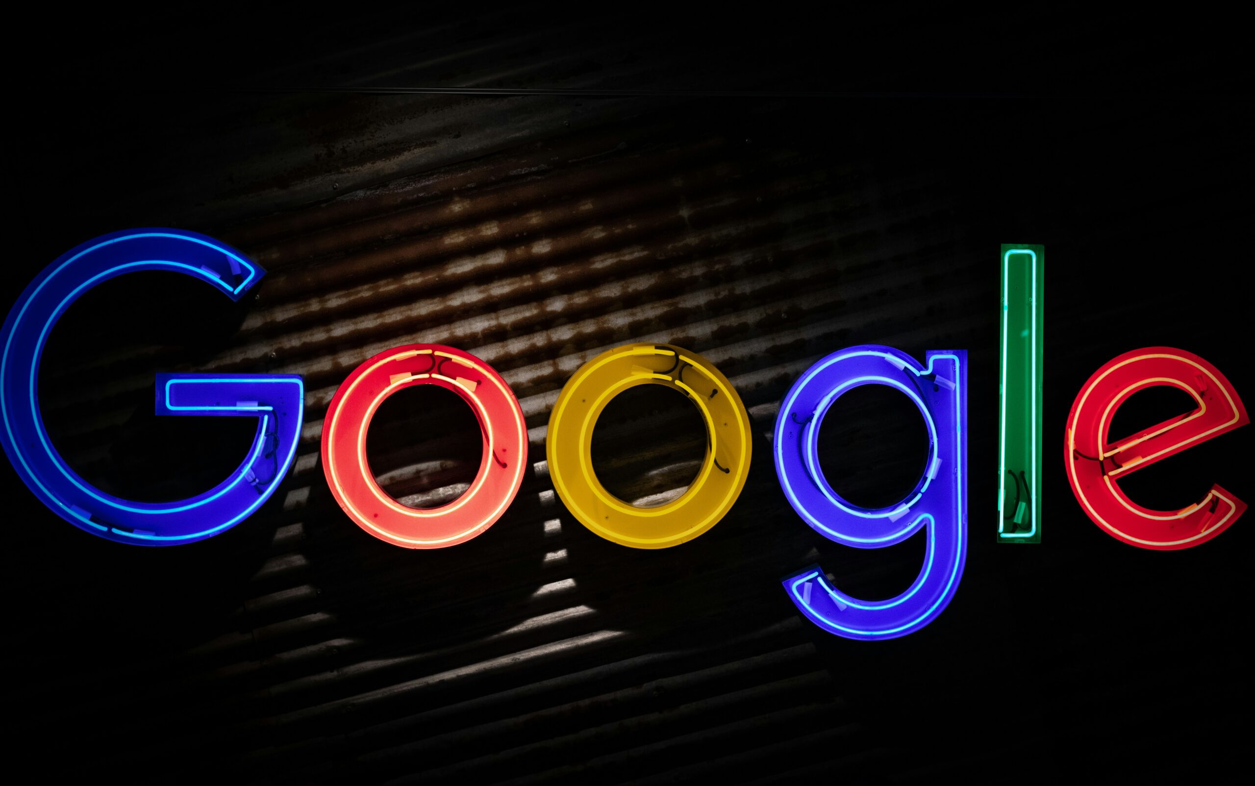
Who does not know about Google? This search engine has become an integral part of the daily life of the majority of people in the world. Apparently, Google has an incredibly captivating visual identity journey. Google was established in 1998 by two university students, Larry Page and Sergey Brin. In 1996, they developed a search engine named BackRub. This engine evaluated the importance of web pages based on the quantity and quality of hyperlinks. They renamed their project as “Google” in 1997, taking inspiration from the word “googol” (a 1 followed by 100 zeros) that reflected their mission to arrange information on a large, global scale.
The first logo of Google utilized a serif font that exuded a formal and traditional vibe. However, as time went by, Google changed its use of serif to sans-serif with rounded letterforms. The logo has become easier to read, recognizable in small-sized media, and adaptable for various contexts. Additionally, Google maintains its blue, red, yellow, and green color combination, adjusting these colors to appear harmonious and visually pleasing on digital screens.
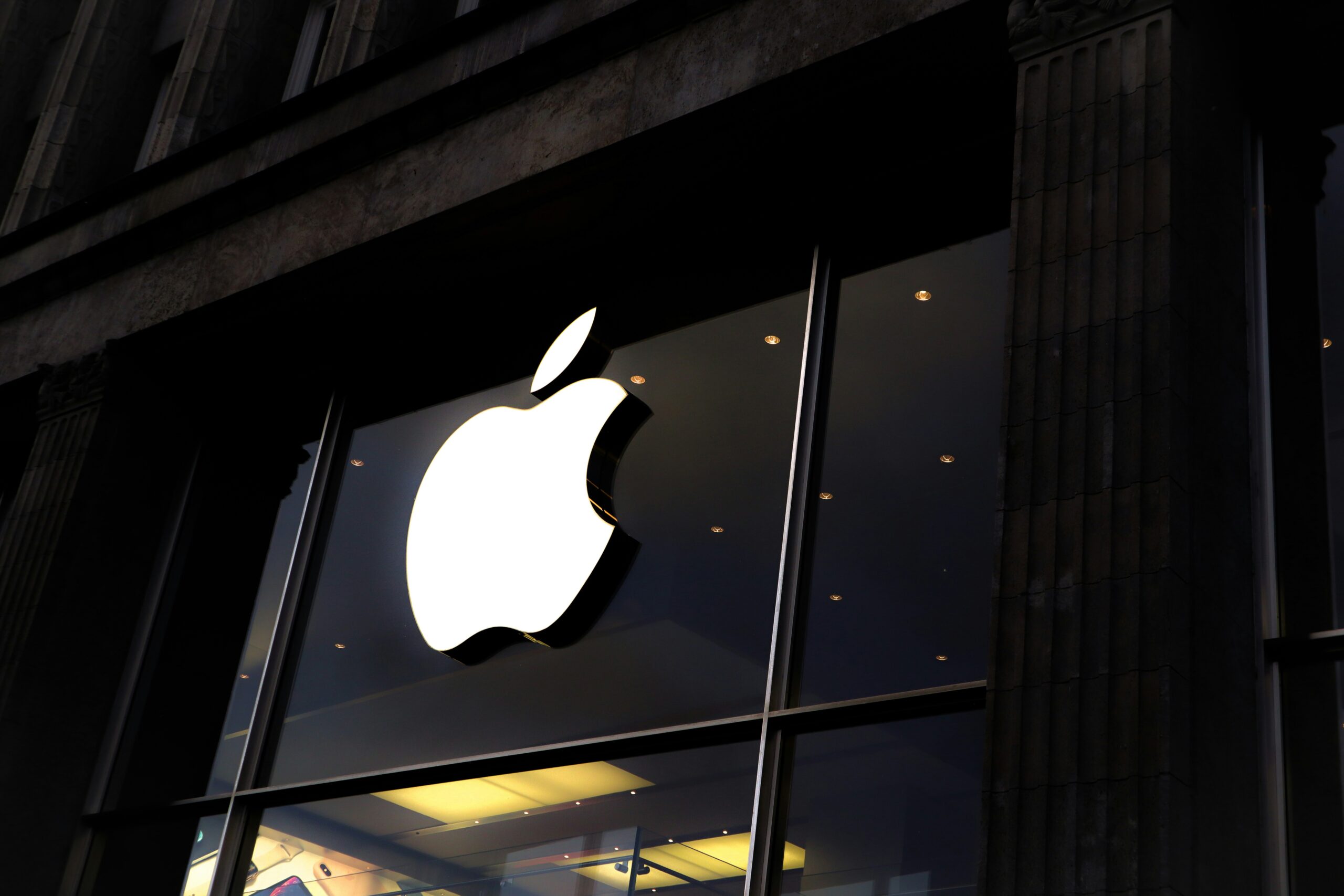
Apple was established on April 1st, 1976, by Steve Jobs, Steve Wozniak, and Ronald Wayne in a garage somewhere in California. They created the first personal computer named Apple 1, and not long after that, they succeeded in creating Apple 2, which became a major breakthrough in the industry. Apple is known for its technology and its unique product design, visual identity, and user experience.
Before its current, modern logo, Apple had several types of logos that show its visual journey. The first logo looked classic with the illustration of Sir Isaac Newton sitting down under the apple tree. It looked overly complicated, making it challenging to remember. Not long after that, Steve Jobs replaced the logo with a much simpler design of a bitten apple by Rob Janoff. Then, in the early 2000s, Apple changed its logo to follow the trend of the time, using a metallic design with a glossy effect for a short period. Only in 2013 did Apple fully embrace the modern logo principles with a flat and minimalist design. This design is not only more flexible and responsive across various digital media but also more in line with Apple’s philosophy.
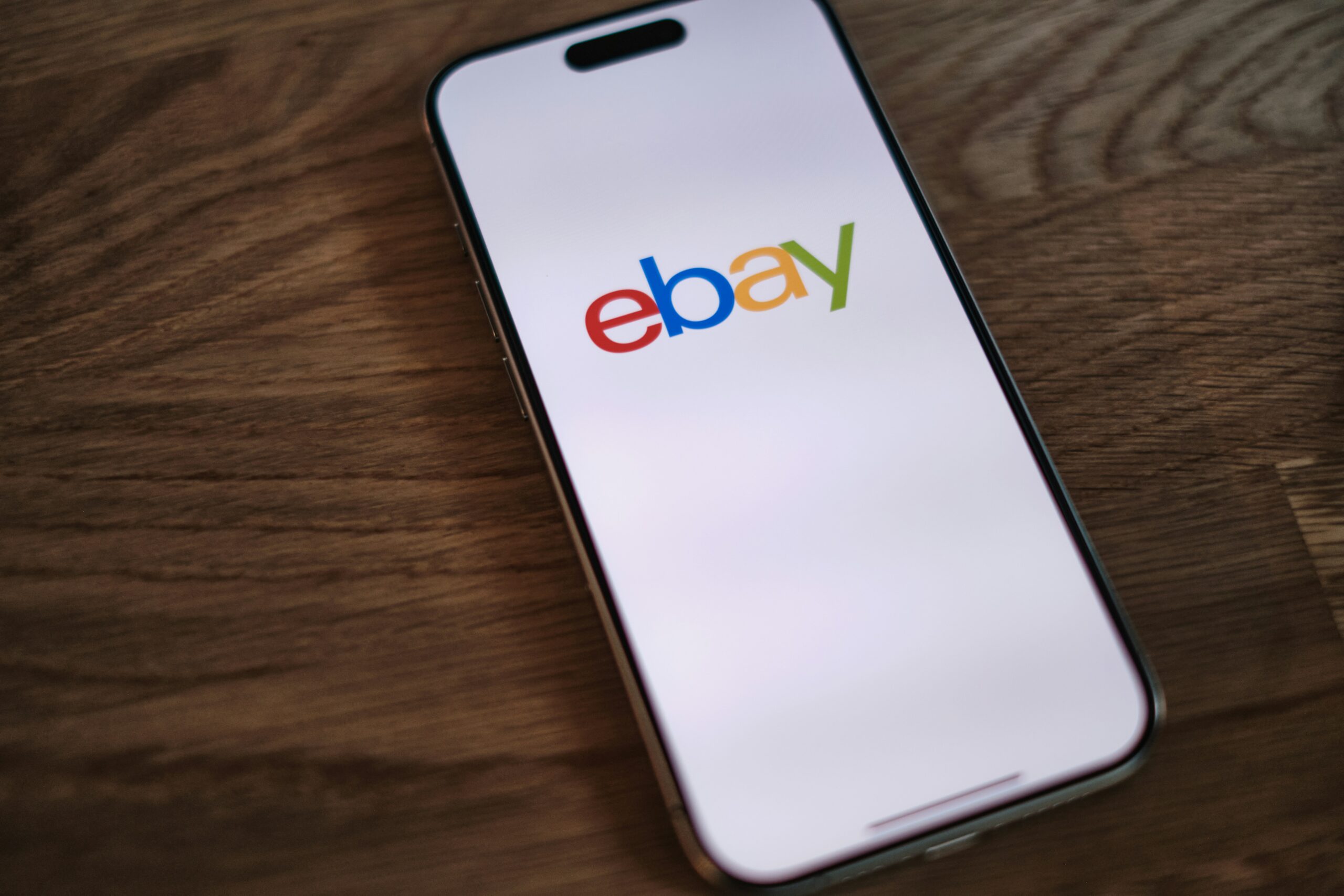
eBay is a global e-commerce platform that allows consumers and businesses to purchase and sell various kinds of goods and services online. eBay, founded in 1995 in the United States by Pierre Omidyar, is a global online auction marketplace. eBay offers a flexible digital trading experience that anybody can utilize, making it one of the world’s most innovative e-commerce platforms.
The eBay logo reflects an energetic, inclusive, and dynamic brand concept, which is consistent with the market’s openness to all segments. The new logo’s typography is simpler and more geometric, with red, blue, yellow, and green colors that each represents something different. The separated letters in the current version represent brand maturity and identity clarity. Its logo is classified as a modern logo because it contains design elements that are simple, practical, and communicative, as dictated by modern visual aesthetic principles.
Although their logo is vibrant, its shape and presentation have been improved to fit the demands of the digital age.
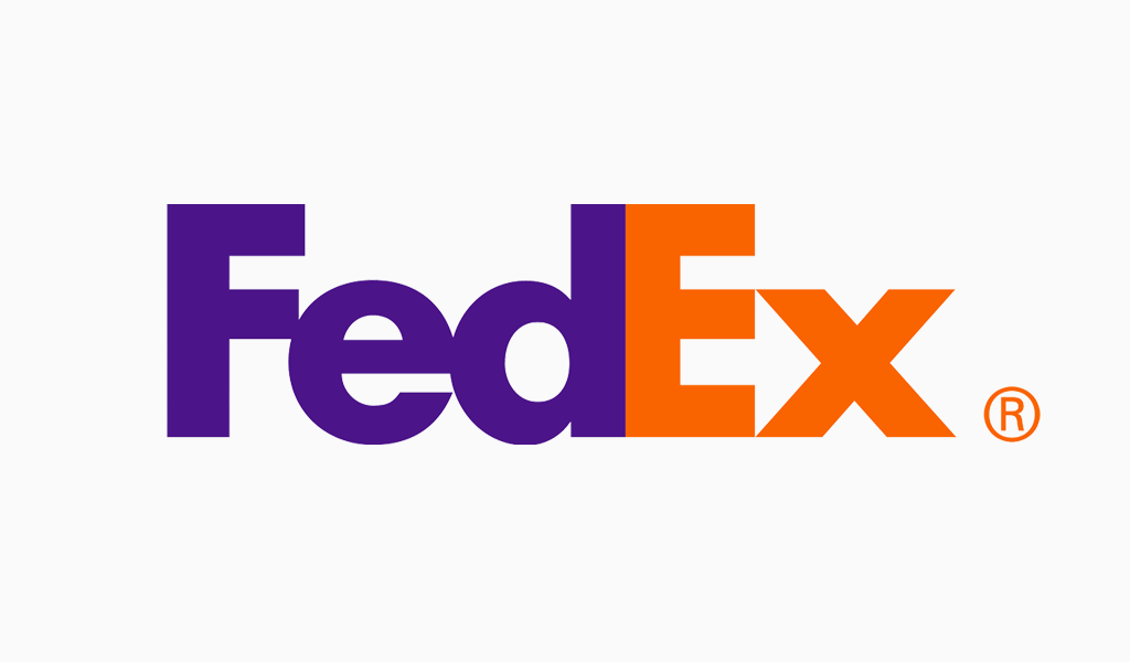
“FedEx” is an abbreviation of “Federal Express,” a multinational logistics company from the United States of America. It is one of the international express delivery and courier services. Established in 1971 by Frederick W. Smith, FedEx offers a quick, accurate, and easily trackable goods delivery in real time.
In 1973-1994, Federal Express had a logo that looked complex, showing capital letters with blue and red colors and striped symbols to show speed. In 1994, the company underwent a significant transformation by renaming Federal Express to its abbreviation, FedEx, and simplifying its logo design.
The FedEx logo is known for its brilliant use of an optical illusion. Some may not realize it, but there is a hidden arrow between the letters “E” and “X” in the logo. This illusion is not a mere design trick; the arrow represents the speed, precision, and a direction to the future. This logo successfully blends minimalist aesthetic, functionality, and comprehensive meaning in one strong visual.
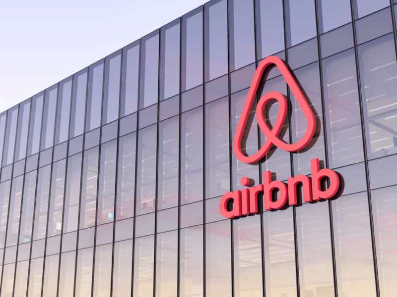
Airbnb is a global digital platform for renting and booking accommodations such as houses, apartments, and villas online. Airbnb comes from the phrase “air bed and breakfast,” which refers to the early days of the service when the founders rented out air mattresses in their living room to guests looking for cheap places to stay.
Three San Francisco natives, Brian Chesky, Joe Gebbia, and Nathan Blecharczyk, founded Airbnb in 2008. They only rented out empty rooms in their apartment, but this idea evolved into a global business that revolutionized the hospitality and tourism industry.
The evolution of the logo from its inception to the present is an extraordinary brand transformation. Its first logo was very minimalist, simply featuring the words “Air Bed & Breakfast” or “Airbnb” in a regular font. In 2014, Airbnb underwent a major rebranding that completely transformed their visual identity. Together with the London design firm Design Studio, they launched a new logo called “Bélo.” This is a brilliant example of modern logo design that combines simplicity with the power of storytelling.
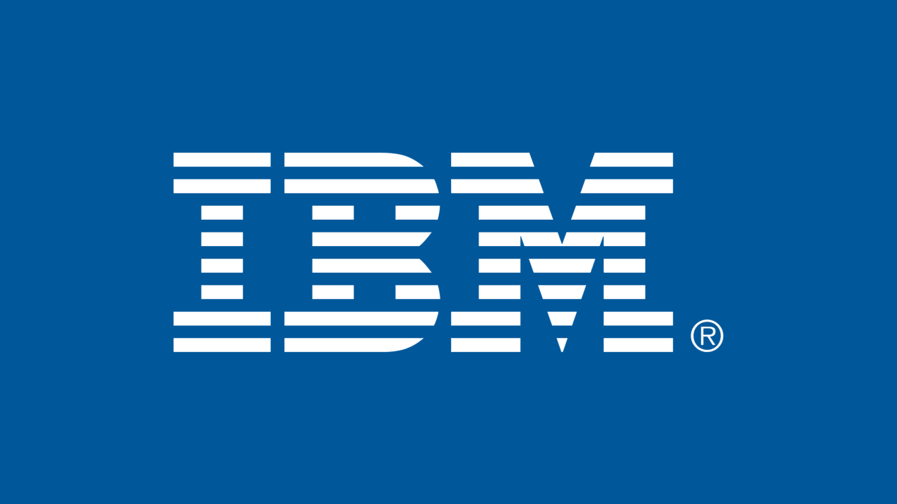
IBM (International Business Machines) is one of the oldest and most influential technology companies in the world, known for its contributions to modern computing, hardware, software, and information technology services.
The IBM logo we know today was designed by Paul Rand, an American graphic design maestro, in 1972. Previously, IBM had undergone several logo transformations since 1924, from traditional serif forms to bold block shapes. The three bold and strong capital letters “I-B-M” symbolize strength that conveys a sense of reliable and robust technology. In the initial version, the IBM design used 13 lines, but it was simplified to 8 to enhance readability. The eight blue horizontal lines dynamically form letters, symbolizing speed, efficiency, and the dynamics of information technology. The blue color is used to convey a message of confidence, safety, and reliability, an ideal image for a technology and business services company. This modern logo is not only visually beautiful but also contains a deep philosophy about who IBM is and its role in the global technology world.
The purpose of a modern logo is to create a relevant, strong, and easily recognizable visual identity amidst the dynamic developments of the times. It is designed with an emphasis on simplicity, clarity of form, and flexibility to adapt across various media and digital devices. With the right design, a logo not only strengthens brand image but also builds trust and enhances competitiveness in an increasingly competitive market.
Having a modern logo style is essential for showcasing a powerful brand image and staying competitive in today’s digital landscape. A modern logo does more than just look good; its sleek, adaptable, and easily identifiable design plays a crucial role in establishing a powerful brand identity.
Discover the essential goals, principles, and inspiring examples of contemporary logos from leading brands. With this knowledge, you can create a logo that not only stands out but also stays relevant in today’s digital landscape.