Korean street food branding is synonymous with a bold, expressive, and attractive visual. Visual identity has an important role in creating the first impression of Korean street food brands amid culinary competition. Brands bring this approach to life through authentic street food carts, eye-catching signage, and attractive instant-food packaging designs.
In this context, font or typography becomes the main element, creating a brand character. A proper font selection can convey the crowded, authentic feel of Korean street culture while maintaining readability across various branding media. The bold, playful, and handwriting-like letter style is often used to affirm the instant, friendly, and energetic impression.
This article talks about the best font for Korean street food branding and its use in logos, packaging, and promotional material. With the right typography strategy, a Korean street food brand can look more consistent and recognizable and have a strong visual appeal that builds the brand identity.
Table of Contents
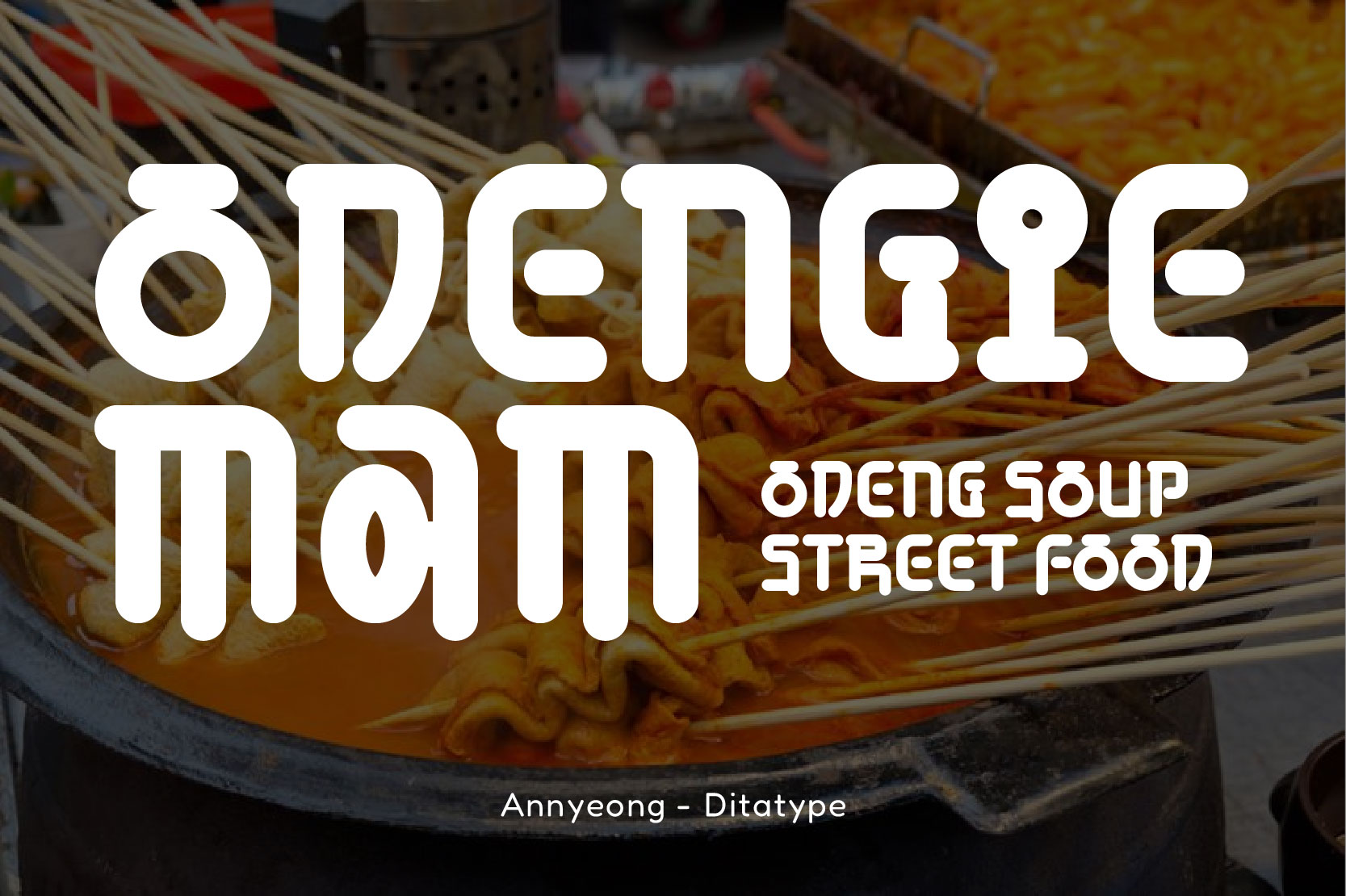
Annyeong is a display font with a strong and expressive visual character. The bold letterform with a round tip and solid structure is inspired by the dynamic and modern Korean typography style. Moreover, the uniqueness lies in its bold and playful look, making it strong visually and ideal to use as a display element.
Annyeong is perfect for Korean street food branding because it represents an enjoyable street atmosphere. Therefore, the use of this font helps the brand to build a consistent, expressive, and relevant visual impression that aligns with Korean street food culture.
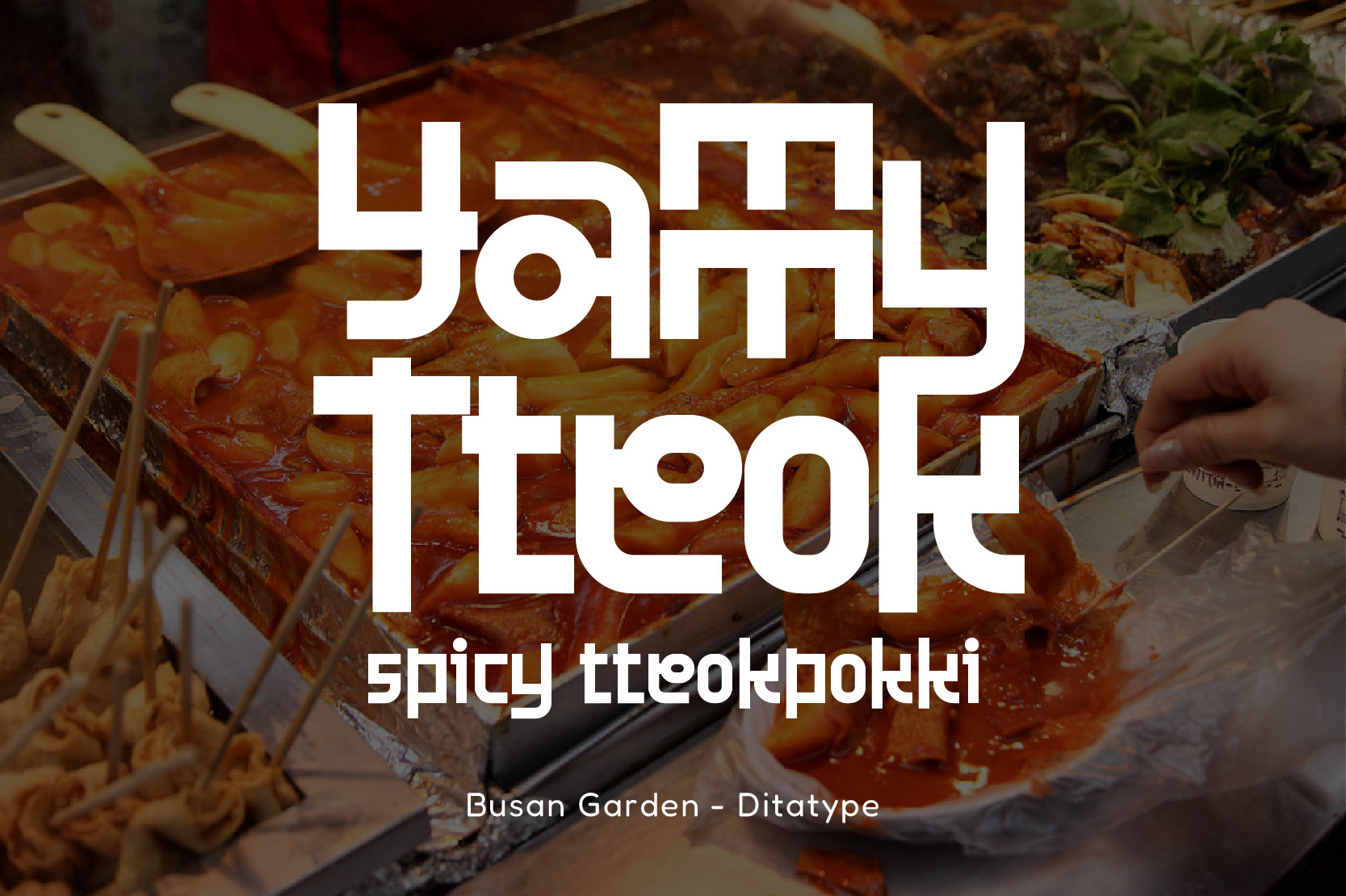
In the context of culinary branding, Busan Garden is a font with a firm, modern, and recognizable character. The geometric letterform has a sturdy and solid structure, creating a stable and strong feel. In addition, its uniqueness lies in the combination of contemporary style and the distinct Korean typography. Hence, the main emphasis of this style is on its visual strength rather than its readability.
Those characteristics make Busan Garden perfect for Korean street food branding that represents a crowded, energetic, and bold street atmosphere. Besides its ability to stand out and look eye-catching, this font helps a brand build a firm, recognizable, and consistent visual identity across media.
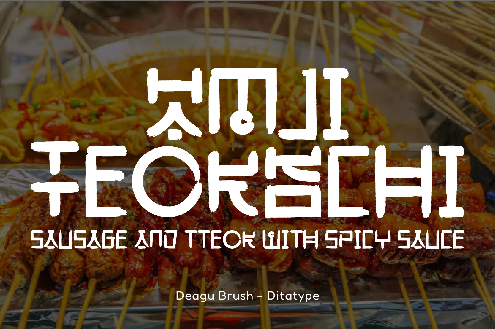
Designed with an authentic brush-style typography approach, Daegu Brush offers a strong, expressive, and energetic visual character. Its letterforms are not fully alike; they have a rough edge and dynamic visual rhythm.
The uniqueness of Daegu Brush lies in its brush look that represents a strong emotional and handmade impression. This font is suitable for Korean street food branding because it can strengthen the bold, spontaneous impression and increase customers’ appetites through the brand’s visual identity.
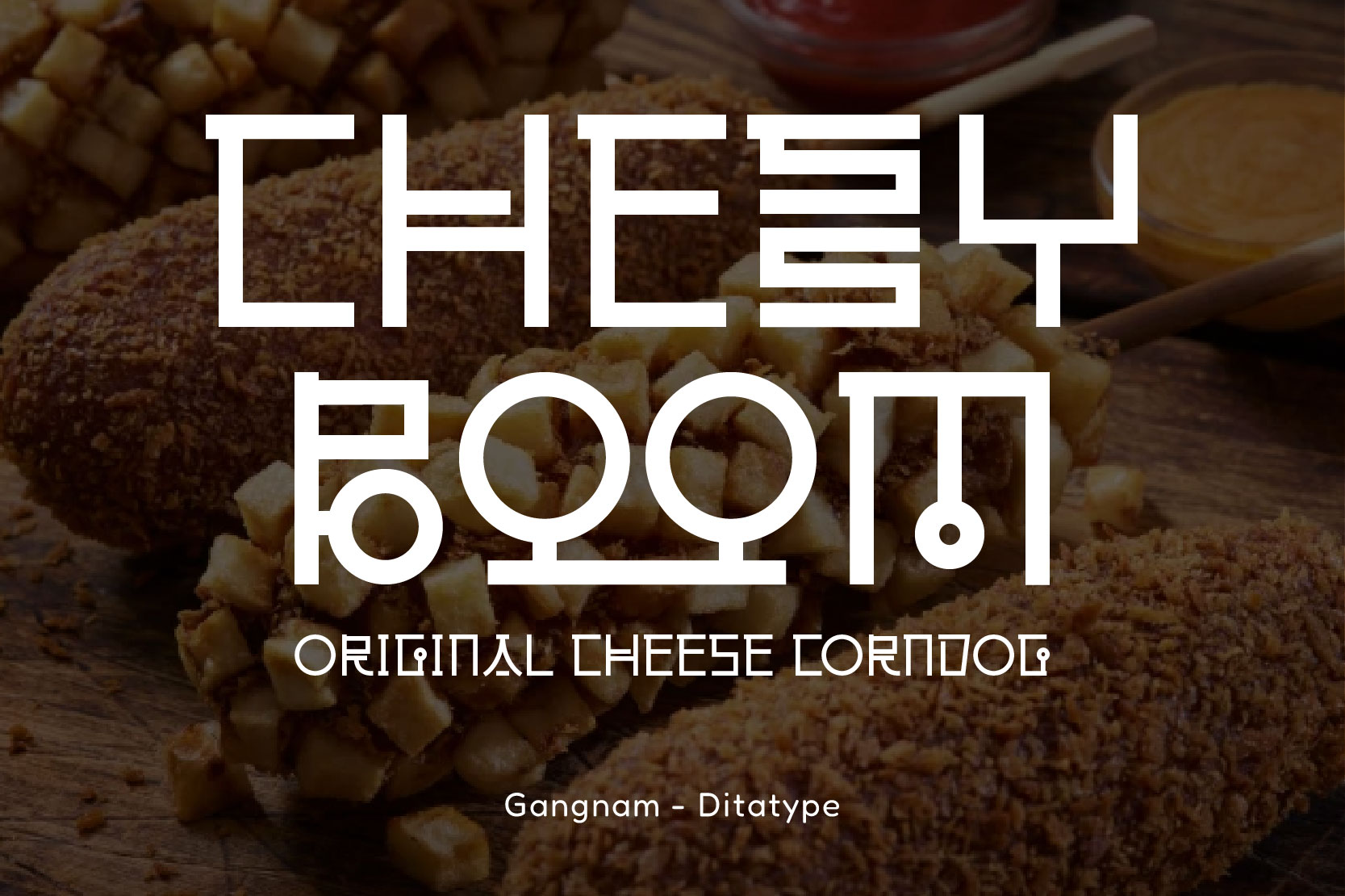
As a visual representation of the dynamic of the modern Korean city, Gangnam offers a solid, precise, and strong character look. The geometric letterforms feature clean lines and balanced proportions, creating a firm impression, and it is visually comfortable.
In addition, this font’s distinct feature lies in its letter management, which is inspired by the Korean typography structure, especially the round details and the unique line cuts. Therefore, Gangnam is perfect for Korean street food branding that presents a modern, hygienic, and confident impression that aligns with the dynamic street food atmosphere.
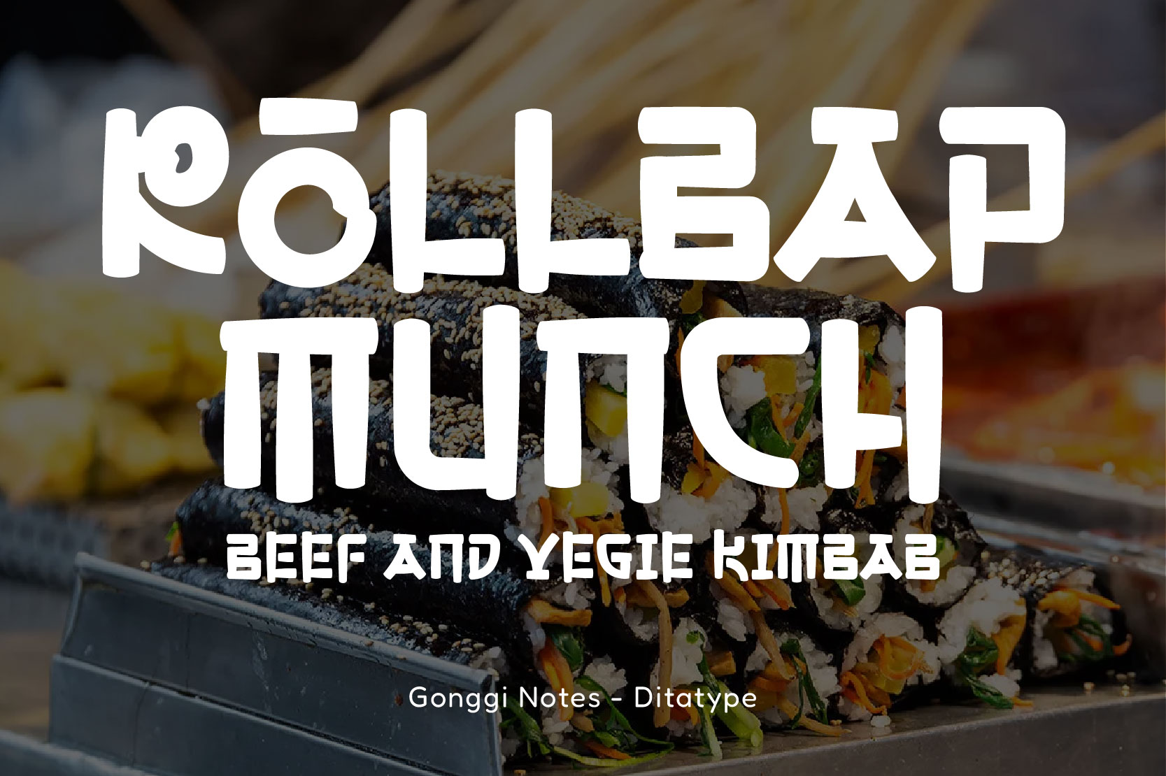
Gonggi Notes presents a warm and friendly impression, like a light conversation happening behind the Korean street food stall. Its letterforms resemble handwriting letters, with round strokes and smooth tips.
Moreover, the proportion among the letters that are not fully alike creates a dynamic and natural visual rhythm. In Korean street food branding, Gonggi Notes is effective for building a friendly, authentic, and warm impression, aligned with the street culinary experience that is close, personal, and savory.
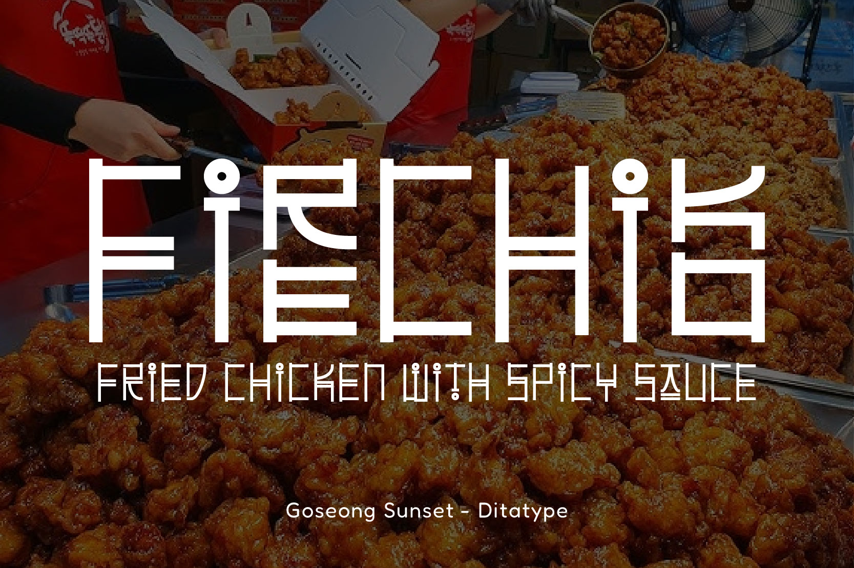
Goseong Sunset captures the visual essence of Korean street food through its slender and tall letterforms. The letterforms come from the consistent line module with an even stroke weight, creating high visibility and optimal readability. Hence, this font is perfect for headlines, logos, and menu boards.
In addition, this font features a combination of modern and urban nuance with a distinct Korean visual that reflects the street food aesthetic. These characters maintain the font’s prominence against the rich texture and color of the food visuals, making it suitable for Korean street food branding that wants to appear expressive and communicative.
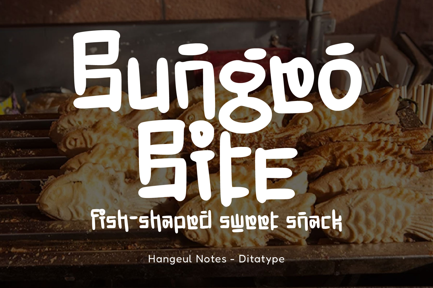
Presenting the distinct casual nuance of Korean street culture, Hangeul Notes offers an expressive and communicative display font. Its letterforms have rounded strokes, flexible proportions, and handwriting-like details. Moreover, the uniqueness of this font lies in the playful and authentic nuance that creates an emotional closeness with the audience.
These characteristics thus depict an area bustling with street vendors and brimming with interaction. Hangeul Notes is perfect to reflect the delightful and distinct atmosphere of Korean street food.
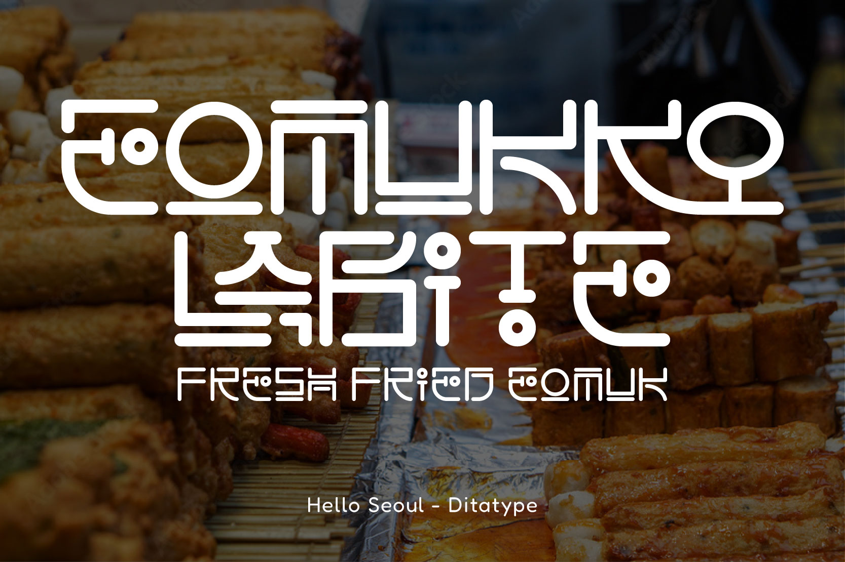
The typography of Hello Seoul draws inspiration from the lively urban and expressive Korean street visual aesthetic. The visual style reflects a city that is dynamic, modern, and has a strong popular culture identity. This font has a controlled geometric structure, rounded lines, and letters that are neatly constructed, creating a modern and organized look.
Furthermore, Hello Seoul’s distinct feature lies in the integration of the Hangeul visual system into a modular and futuristic Latin form without losing its friendly and communicative character. That is why this character allows the font to stand out amidst dense food visuals and serves as a key attention-grabbing element. With its clean yet energetic personality, Hello Seoul is ideal for Korean street food branding that seeks to appear contemporary, dynamic, and authentic.
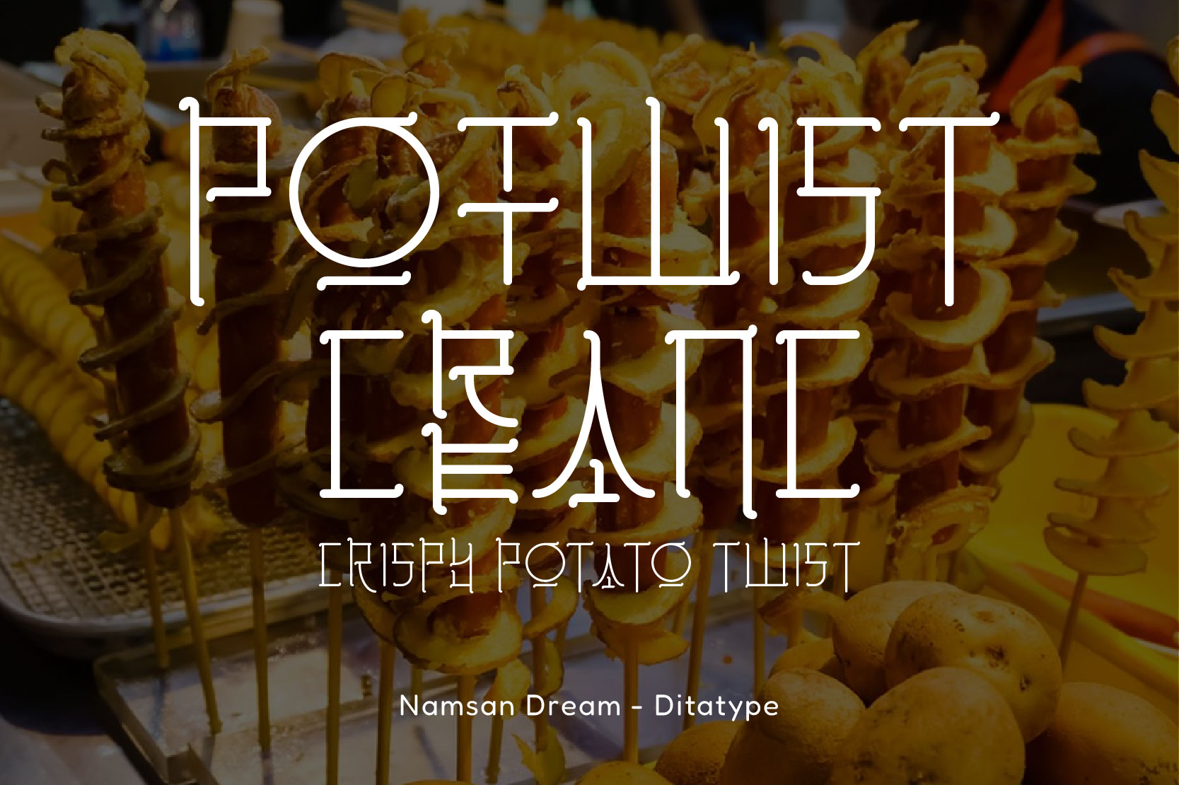
Combining Korean urban aesthetics with precise typography detail, Namsan Dream offers a light and modern display font. This font gives a dynamic impression and reflects the spirit of contemporary design, which resembles Korean cities’ visual culture. Namsan Dream features a distinct feature in its letterform detail, which is inspired by the Hangeul structure that is processed in a modern and decorative way. Therefore, it conveys a futuristic feeling while maintaining a sense of warmth.
In addition, its visual character creates an interesting contrast when placed against dense, colorful food images while maintaining a clear typographic identity. With its unique and trend-driven personality, Namsan Dream is suitable for Korean street food branding that seeks to be creative, distinctive, and visually appealing.
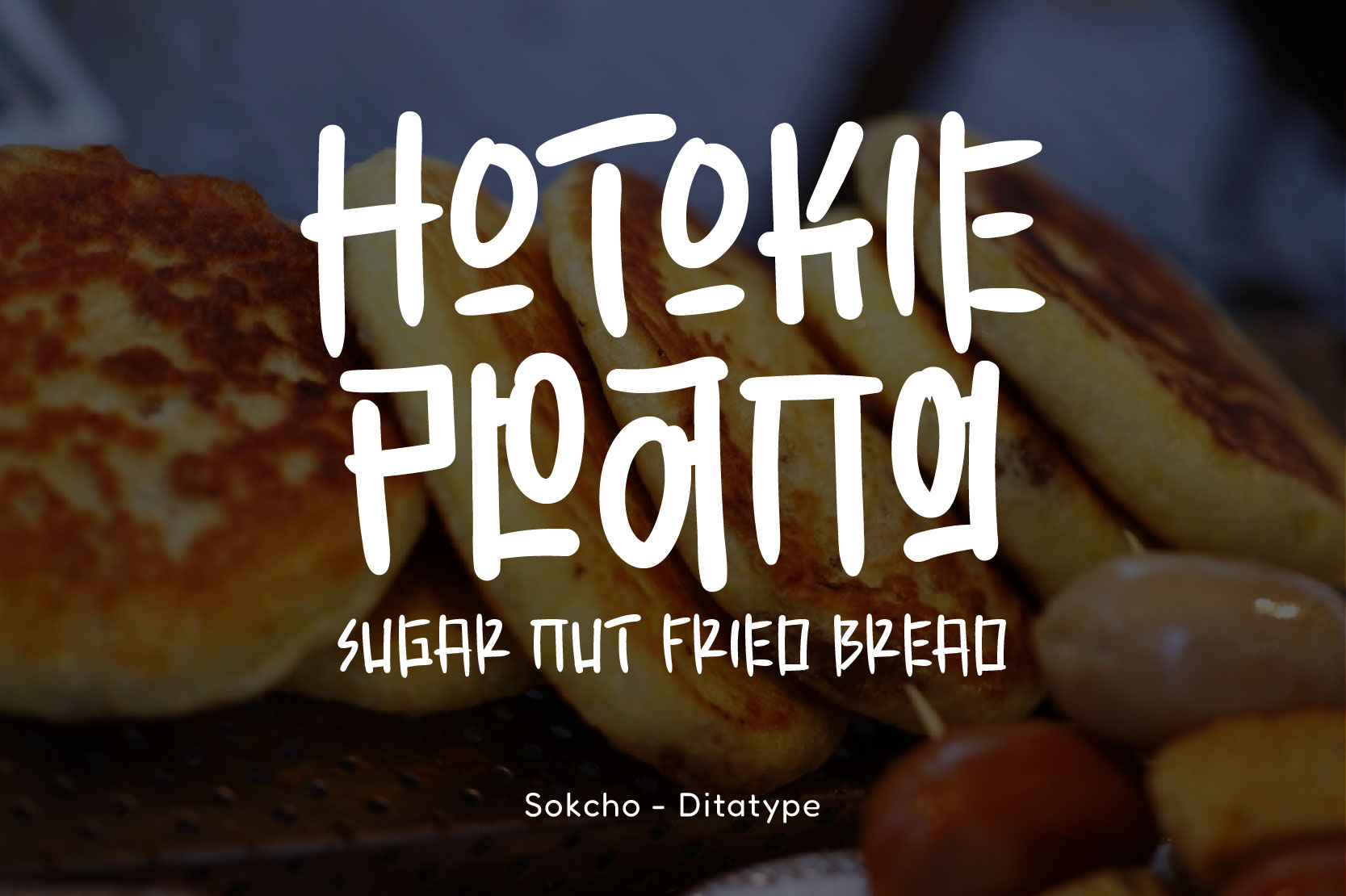
Reflecting the warmth and simplicity of Korean street food, Sokcho offers a display font with an expressive handwriting style. The letterforms character resemble a handwritten letter with rounded strokes, varied weight, and relaxed proportion, creating a friendly, fun, and approachable impression. That’s why this visual style strengthens a friendly, informal feeling, aligned with the casual and direct interaction of the street food atmosphere.
Sokcho’s uniqueness lies in its natural and spontaneous visual expression, as if written directly on a menu board or street vendor’s packaging, creating an authentic and natural feel. Thus, it is ideal for Korean street food branding, which aims to appear playful and friendly and deliver a visual experience that resonates with everyday Korean street food culture.
The series of Korean street food branding fonts discussed demonstrates the strategic role typography plays in building a brand’s visual identity. Each font presents a distinct character, yet they share a common thread: representing the dynamism, warmth, and authenticity of Korean street food culture.
Because of that, designers or brand owners need to choose typography that aligns with the brand’s character and positioning. By choosing a proper font, the Korean street food identity can look stronger, recognizable, and memorable for the audience.